Photo by Denis Mortell
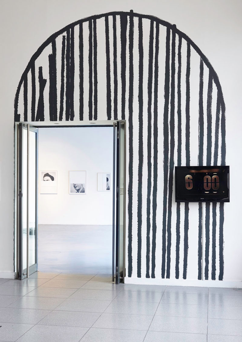
∞ (Broken Mirrors) begins in the NCAD Gallery lobby with Lee Welch’s New Now. An arch is marked out in cross hatched mini-roller-width blueish looking grey paint, suggesting a doubling of the gallery’s current entrance through an older form in this newly remade space (the gallery was once the Thomas Street Fire Station). A large flatscreen displays a cinematically filmed, zoomed in, pre-digital electric flip clock by Jonathan Mayhew. Early in my life it was already too late is perpetually at 5:59, so closely shot and dramatically slowed, it flips to 6:00 for a fraction of a second and the video loops. There is something mesmerising and epic about it.
A passage and time. The passage of time?
The PR/curatorial premise puts forward that the show “explores the concept and representation of the future and its legacy”, and purports to look to both past and sci-fi futures, to possibilities and to futures lost.
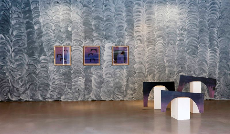
Photo by Denis Mortell
Inside, arches abound. As monoprints, black backgrounded by a split fountain, and as sculptures, or props, placed haphazardly on intentionally dirty plinths, one centrally placed and lofted as a display in the window. Purples and blues dominate this motif. Welch, an artist known primarily for his conceptual sculptural installations, has taken to the anachronistic, or at least historically rooted, crafts of painting and a printmaking in this show. It appears that there is some kind of programmatic connection with Black Church Print Studio.
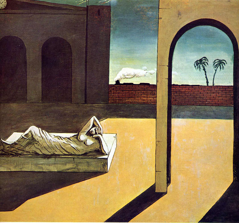
But what can we take from these repeating arches? Together, and in the combined screenprint and woodblock form, they take on a commercial appearance. Reproduction is inherently part of printmaking for sure, but Welch’s lingering raises questions. It reads as product or brand construction, or logo even, displayed in a varied yet consistent way. That’s not to take away from their aesthetic appeal or symbolic value. The arch itself meaning support, a portal, an exit; a way through. Architecture is derived from arch builders, it is foundational to all building. The vault, the dome are all extrapolations of the arch. Welch’s works also recall de Chirico’s Surrealist works of lonely psychologically infused Italian-esque World War II era urban space.
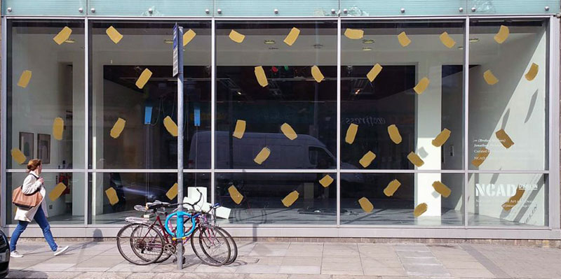
Photo by Denis Mortell
The front plane of the street-facing window is rendered with large painted and widely spaced brown-looking dabs and titled: A screaming comes across the sky. A reminder of this not-immediately-penetrable surface, the surface which demarcates gallery and not gallery; a clear wall. The back gallery wall provides surface for I still don’t even know for sure what a tendril is, a white on black painting, and is effectively whitewashing black. All the way across and top to bottom, organised in regular stripes in a human scale circular motion. I think of a vacant shops’ windows ‘soaped’ over to prevent peering in.
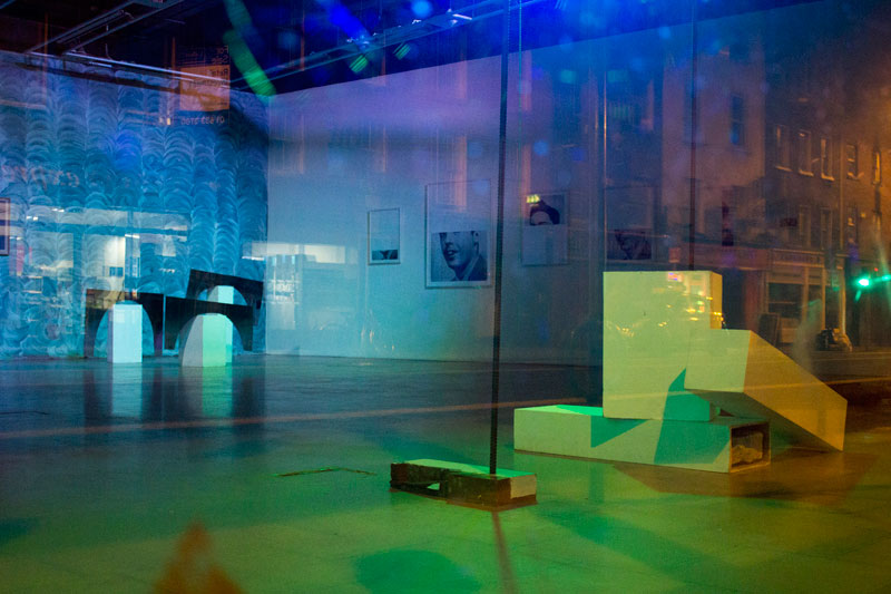
Photo by Denis Mortell
The transformation of the gallery for ∞ (Broken Mirrors) by Welch is distinct. The architecture of the space is considered, especially as it works as a showroom (or aquarium) to Thomas Street. Passing by at night, as I was reminded by the artist a few times, this consideration becomes clear as it is lit in a range of clubby LED coloured lights. This is not evident in the daytime regular gallery hours. In combination with the front and rear murals, and with Mayhew’s face down screen, I think it is a rather clever acknowledgment of the real audience, the passing footfall on Thomas Street that most likely does not engage directly with the gallery. It also is an acceptance of the limited access gallery hours provide for audiences.
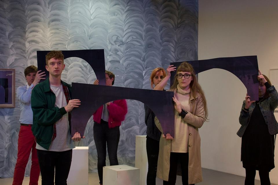
Incidental documentation from a performance shows volunteers unassumingly holding the arches (Perhaps its familiarity rendered it temporarily invisible to you was one of the titles of these works utilised in the performance) in some kind of formation. This was gleaned purely from social media, but when I asked for documentation of the event, I was told it wasn’t officially recorded. Which is interesting, as this is at the root of Performance Art and its rejection of the commodifiable art object some 40 or more years ago. ‘Happenings’ come to mind as well. But this, and the window and wall paintings, is in contradiction to the other work Welch has shown, all very much couched in the art object as commodity. Welch has always seemed to relish the role of artist as trickster, creating elusive works drawn from obscurity, yet always somehow totally equal parts fashionable and perplexing. I’m not sure if that is what is going on here though.
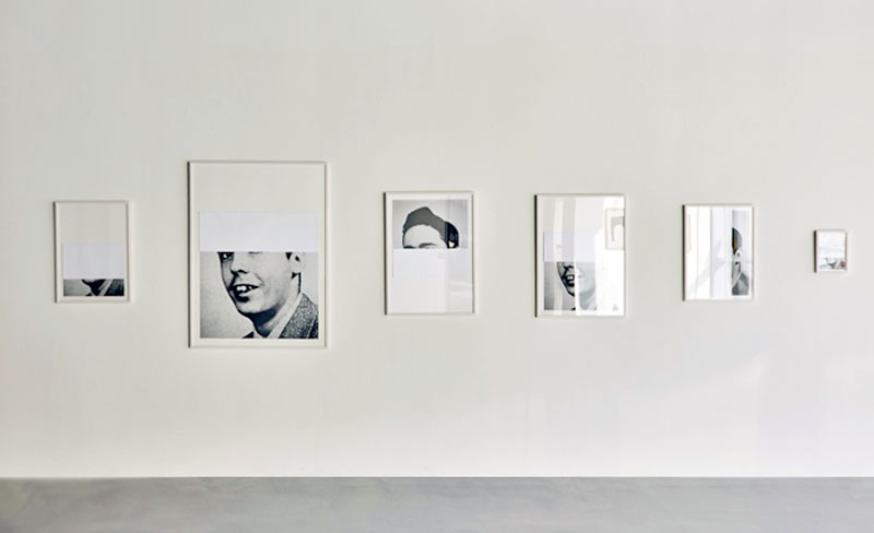
Photo by Denis Mortell
Directly across from the gallery entrance, there is a suite of six photographs. Or photographs of photographs. All oddly sized and featuring glimpses of the same man from, what looks like, the 1950’s. Knowing this, it is an easy line to Boltanski or Levine, but this series leaves us wanting, and on purpose. The photo is obscured, folded back on itself, to reveal only segments of his face, never the complete picture. Oddly, the suite is titled as a whole (Logical validity is not a guarantee of truth) as are the individual works (Vineland, Mason & Dixon, V, Bleeding Edge, Inherent Vice, The Crying of Lot 49). Cursory post-gallery research reveals the rest of the portrait. It is a rare photo of Thomas Pynchon. The individual titles are those of his published novels.

Pynchon is a famously elusive, nay, reclusive American writer which Mayhew dwells on through the show. His portraits of the author take a literal approach to hiding. Cryptomnesia, a flatscreen that is face down in the middle of the gallery floor provides only glimpses, or glimmers, of light shining out from the sides. Audio of something like a protest or demonstration is emitted. The obfuscation connects this to the photographs, at least as a way of working.
Pynchon Poem, a ‘casually’ placed vertical flatscreen on the floor near the entrance, is a video work that presents poems. I am guessing derived or inspired from Pynchon’s writing. A concrete poem is one which uses the typography of the poem in a sculptural or formal way to add additional meaning to the text itself. This is what Mayhew has done, scattering the type on screen. Plus he uses the additional element of time. The viewer has only a set period in which to read the text of each poem until the next appears. Then to wait for its reoccurrence, nicely linking us back to his perpetual 5:59 clock we first encountered.
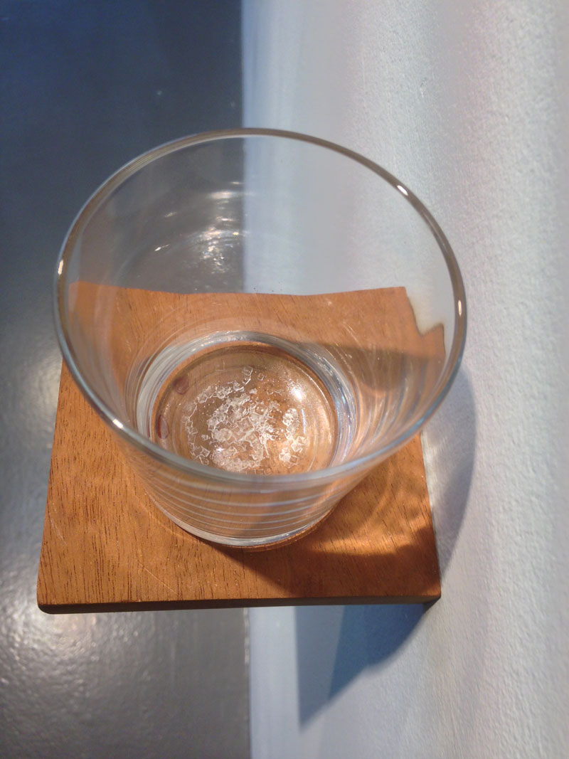
Just to the side of this are two more pieces by Mayhew. When this is over, I will have forgotten & you will have seen the future, which is comprised of a wooden shelf and a glass of tears. Listed as a performance, it must have been a successful disappearing act as the tears were long since dried up at my visit, leaving only a salty residue to look at. Possibly a nod or even an overt reference to An Oak Tree, a 1973 conceptual work of water in a glass on a shelf and text by Michael Craig-Martin housed in the Irish Museum of Modern Art.
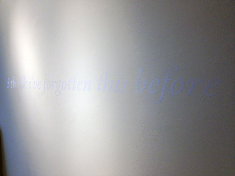
Just over this runs The Repetition, white vinyl text on a white wall. It says “i think i’ve forgotten this before”. It can be (barely) seen as a continuation of formally driven text based plays that Mayhew has developed over time. The outcomes include overlaid text that self redacts, and backwards and forwards text pieces that are palindrome-like. Of course Barbara Krueger and Kay Rosen pioneered this style of text on gallery wall work, but with different intents. And more recently Hank Willis Thomas has played with colour negation, change, and transference in text, but in the context of racial perceptions in the US. I’m not sure why When this is over, I will have forgotten & you will have seen the future and The Repetition are placed so closely together. Is it to communicate with each other? Or to be read as one? Or just for lack of space? Both together and separately I’m left a little non-plussed.
As for the investigation into the concept of ‘future’, the curatorial premise seemed overly, but not overtly, loose. The title too, ∞ (Broken Mirrors), seems impenetrable and random (as do most of the titles of individual works tbh). Both appear ‘slapped on’. Why do we need this as an audience or as art-insiders? Why stretch an inexact idea around two individual practices; bodies of work? Better yet, maybe it is okay just to show two guys’ recent work? However, I’m not sure it entirely matters after viewing the exhibition. I did find the show surprising, well constructed, and stimulating.
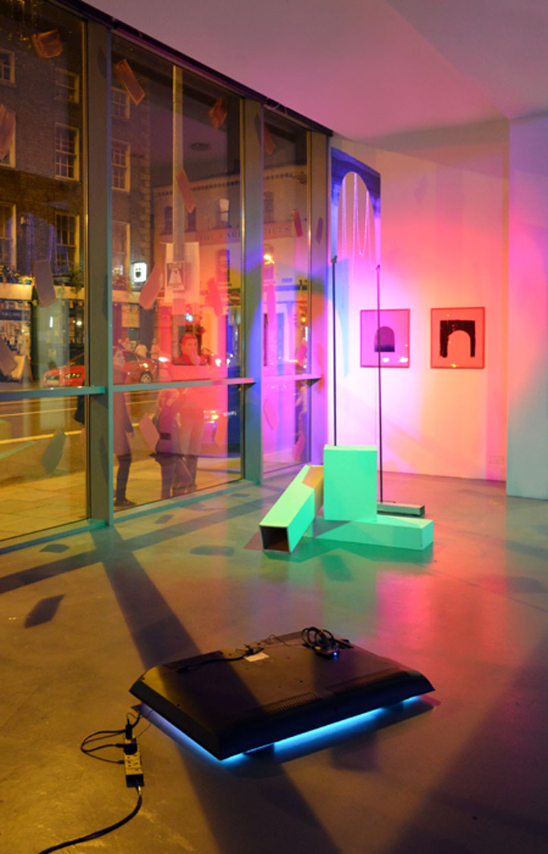
Photo by Denis Mortell
While ∞ (Broken Mirrors) delivered more than anticipated, especially in its consideration of the street level relationship between the art college gallery and The Liberties, my very first impression of the show was that it looked like a stall in an art fair. Upon reflection, I think this impression sticks. That means it was ‘tasteful’, digestible, of our time, and ‘ready to be sold’-looking. But is this a good thing in and of itself? Or is it anything at all? What it is exactly is a visual language and a way of presenting (or representing really) that relies on our contemporary conventions of display and of art object making.
‘Avoca Blue’ is an expression a friend coined. Avoca is of course the Irish-owned weavers/boutique/café mini-chain. While not the official colour of Avoca, ‘Avoca Blue’ has come to describe that ever so conservative petite-bourgeois tendency to not stand out through imitation via money. To keep up with the Joneses by blending in. ‘Tasteful’ is translated into unornamented, and definitely not garish. Ultimately driven by fear and inevitably resulting in a conformist ‘no chances taken’ approach to fashion and style and home-decoration. It is alternatively know as ‘Greige’. That certain non-colour of gentrification. Of course the colour of ‘Avoca Blue’ is almost always in combination with ‘Greige‘.
Relatedly, the term Art About Art comes up, usually dismissively, every so often. I struggle with it, because, like semantics (also used derisively by default), I find it fascinating. But for me the real issue lies in Art Duplicating Art (or Art That Looks Like Other Art). Art whose form is imitative of its contemporaries. This is the Avoca Blue syndrome only in the Art World.
As much as I respect all of the people behind and in it, and as much as I did enjoy many elements of the show, this show is cautious and undeniably ‘Avoca Blue’.
Photo from Avoca
∞ (Broken Mirrors)
Jonathan Mayhew and Lee Welch, curated by Marysia Wieckiewicz-Carroll.
NCAD Gallery, Dublin
10 September – 6 October, 2015
Review by Jim Ricks
Editor’s note (16/3/16): The title of the work used in Lee Welch’s performance was mistakenly titled I have no idea where this will lead us, but I have a definite feeling it will be a place both wonderful and strange previously. That is in fact the title of another similarly constructed work in the exhibition. We’ve corrected this and modified two observations about the colours of the paint used by Lee Welch.
 Look Closer says
08/03/2016 at 14:06An arch is marked out in cross hatched mini-roller-width blue paint, -It’s gray paint.
 Look Closer says
08/03/2016 at 14:07The front plane of the street-facing window is rendered with large painted and widely spaced brown dabs – The dabs were actually gold.
 admin says
12/03/2016 at 11:01Thank you for your technical corrections! They don’t really impact the thrust of the review however, so I think I’ll leave them as is.
 Fact Checking says
14/03/2016 at 13:57Where did you get the title for the performance?
 admin says
15/03/2016 at 22:29The title of Jonathan Mayhew’s performance was, as were all the titles, given to us by the gallery. The title of Lee Welch’s performative event which utilised the sculptures, I have no idea where this will lead us, but I have a definite feeling it will be a place both wonderful and strange, is unknown to us.
 Fact Checking says
16/03/2016 at 12:24‘I have no idea where this will lead us, but I have a definite feeling it will be a place both wonderful and strange’ was the piece near the front. ‘Perhaps its familiarity rendered it temporarily invisible to you.’ was one of the titles of the works utilised in the performance.
 admin says
16/03/2016 at 20:01Thanks for your observant eye Lee, we’ve corrected those, that title, and noted it.
 John Pilger says
25/07/2016 at 15:12Shouldn’t you amend all the past reviews on this site to identify the true author Jim?
 admin says
12/09/2016 at 18:51Perhaps you should lead by example Lee? ;-P. Of course I reserve the right to do what I want on my own site, but if you are referring to our use of the common practice of using nom-de-plumes, I’m sure I’ve discussed this before. The short answer is that collaborative pieces were assigned a new author’s name in the past. Any other questions?